Tuesday, November 23, 2010
Project Spotlight
Ok so I didnt read about this in a magazine or experience it myself, but a project that really inspires me is the tv show "Extreme Home Makeover". I really admire all the people that come in to help provide a home for the less fortunate. If providing families that need the help wasnt enough, they also build the home around their special needs (when required). I think that is important when becoming a designer, bc your client may not have special needs to the extent of the people on the show but it kind of makes you want to think out side of the box and make whatever changes are required, not only work for the family, but they also make it fun for the family dealing with the disability. I think that this is so important now, after our lecture on making design function for everyone.
Sunday, November 21, 2010
Estelle's Frozen Yogurt Field Report


I like the white and silver color scheme with mainly random pops of color (color wall here and there) makes it feel clean yet warm and fun. Everything has a matte finish to bring your attention to the bright orange shiney mosaic back splash behind the main counter, bringing your attention to the menu that was in white.
The flooring was painted cement, the walls were matte white with the spartic colored walls with painted flowers on one. the ceiling was white with some added hidden lighting that really makes the space stand out. There were also recessed cans lighting the area with a couple hanging pendants. They had some rounded walls which gives the space a smoother calmer feeling. They picked organic plastic chairs with some built in benches with white round tables. They also had some picts of yogurt on the walls. This places was really impressive because as we just talked about, its not only a healthy place to grab a snack, its also a green store. It kind of relates all kinds of ideas of healthy together and incorperating white and the "healthy" colors, I think this designer did their research. I really liked this project and it makes you look deeper into things.
Thursday, November 18, 2010
design that could have been better

Friday, November 12, 2010
inpiration of the week
My friend has moved into his first place by himself and has nothing.. no furniture no real decor.. nothing. So this past weekend, I was asked to help him make his new place his home. I went to a lot of stores in Dallas looking at different stores trying to get some inspiration to start decorating.
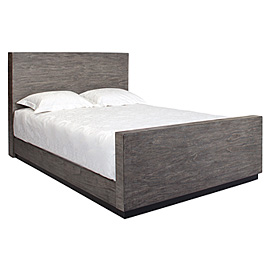
We first visted the Z Gallerie where I fell in love with this bed (of course it looked better all made up and decorated... )
 And I thought this one was interesting but his space doesnt really have enough room.

He totally loved this couch.. which I am not particularly fond of AT ALL...
 We also visited IKEA.. the best place ever! (if you have a truck and live close to Dallas which I dont)
We loved all the storage units but he really loved this chair..
 I really like this look for a bedroom. Hes young and its a bachelor pad, but I think it can still look classy.
 We bought a gray/black/white pic of a surf boarder walking on the beach to use above the fireplace, so I was thinking of doing like a color scheme like that but throwing in a color. Maybe dark purple... Not sure yet.


 Anyways.. Those are a couple of the things that I was looking at this week.
We first visted the Z Gallerie where I fell in love with this bed (of course it looked better all made up and decorated... )
He totally loved this couch.. which I am not particularly fond of AT ALL...
We loved all the storage units but he really loved this chair..


The bedroom that really inspires me that he probably wouldnt like is..

Monday, November 1, 2010
Career in Hospitality::Nightclub design
This has to be my favorite blog topic yet..
My goal is to be a Night Club designer. Here are a few of the places that I have been//go to on a regular basis that inspire me.
First and foremost is VICE. Downtown fort worth, this is the club that I frequent most often..
 Vice is in the basement of the tower and is kind of limited on space but they make this Ultra Lounge pretty exciting with their dark brown wood and orange accents and amazing lighting. Also owned by Vice is Cameo featured below and Mantus both located in Dallas..
 Cameo.. kinda the same set up- they do the bottle service thing as well with the dance music. Amazing lighting as well. Also pretty impressive. I only have visited this club once and that was this past Saturday night and it was all decked out for their Halloween party so I may need to go see it under normal circumstances to get the full effect.

 Mantus is the other third club owned by the Emil and Jose and it, too, is set up bottle service style and it featrues djs from the area to come "spin". They all kinda match each other but they are also seperate. Mantus is literally on the same block as Cameo so its pretty convient.

 Thrive is another club that has recently opened. They are known for having celebrities come and visit and party the night away. They also offer bottle service.


My goal is to be a Night Club designer. Here are a few of the places that I have been//go to on a regular basis that inspire me.
First and foremost is VICE. Downtown fort worth, this is the club that I frequent most often..


Plush is probably my favorite decorated night clubs that I have been to in Dallas. This mulit-level bar is pretty uniquely decorated with its 3D butterfly enterence, lady faces wall covering, stripper poles at every bottle service table, and go go dancers on the bar. This is one of the two bars that have inspired me most to become a night club designer. The other being Pure in Austin..
The pictures do not accurately describe the uniqueness of this bar. They use a lot of lighting effects with blue lights. They pretty much use white and blue as their colors and give a feel like everything is made of ice. On the third level everything is red
This is Ghost Bar at the top of the W hotel in Dallas. I have only attended one event here but it was amazing. The lighting and view from the balcony are amazing. This bar is more spacious than most of the bars in Dallas that I have went to.
Subscribe to:
Comments (Atom)